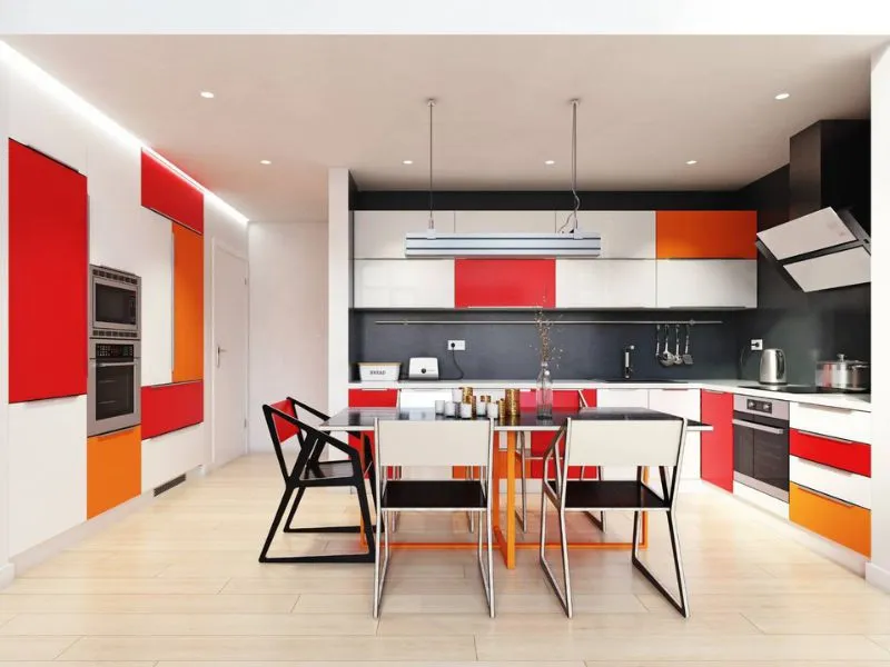
What is Color Theory in Interior Design?
Color Theory is the study of color in relation to art and design.
It involves understanding how colors interact with each other and how they can be used to create harmonious compositions.
Color theory implies using various principles such as hue, value, intensity, and temperature when choosing harmonizing colors.
By combining different tints, shades, and hues of a single color or mixing multiple colors, designers can create desired effects that evoke emotion or convey a specific message.
📘 Key Takeaways
- Color theory studies the harmonious combination and interaction of colors.
- In interior design, color theory ensures visually cohesive and balanced spaces.
- The color wheel helps designers choose schemes like complementary or monochromatic for desired effects.
- Different colors can evoke specific moods, such as red for excitement or blue for calm.
- Various schemes, like monochromatic or complementary, achieve distinct design outcomes.
What Is The Importance of Color Theory in Interior Design?
Color theory plays an important role in interior design by allowing designers to create a visually pleasing, cohesive, and harmonious atmosphere within a space.
By understanding how color works and the effects of different combinations, one can use colors to create balance and unity or create a contrast to emphasize certain elements.
The color theory also helps designers develop effective color schemes that work harmoniously without being too overwhelming or jarring.
The importance of color theory goes beyond interior design; it has numerous applications in various fields, such as art, fashion, and product design.
How Does Color Theory Help in Interior Design?
Color theory can be an invaluable tool in home design, as it helps to create a harmonious and visually appealing space.
By understanding how colors interact with each other, designers can choose color combinations that will bring a room to life.
Color theory also helps designers develop effective color schemes that balance warm and cool colors or create contrast between different components in the room.
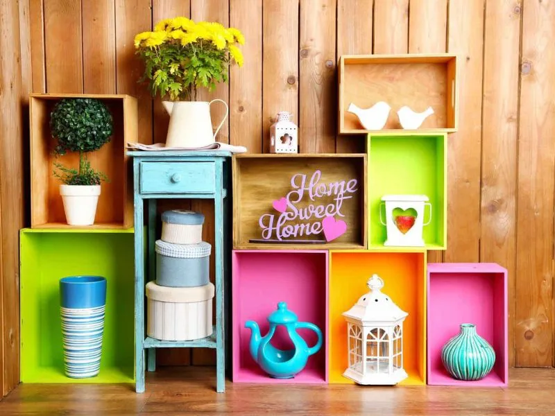
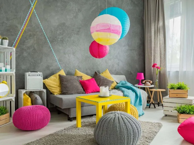
Designers can inject a sense of drama or energy into a space by using bright colors like reds, oranges, and yellows.
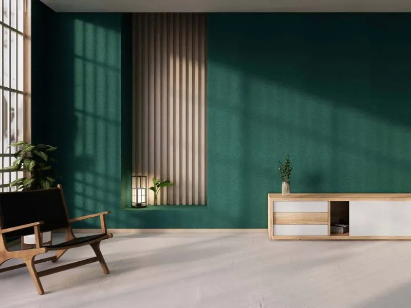
On the other hand, light colors such as blues and greens can create a calming atmosphere.
Color theory also helps determine the best lighting for each space, as different types of lighting will affect the way colors appear in specific environments.
8 Color Theory Basics for Use in Interior Design
With the 8 basic color theory principles, designers can combine colors effectively to achieve desired effects and evoke certain moods.
Color theory also gives insight into how light interacts with color, allowing one to use proper lighting solutions.
By understanding the basics of color theory, designers can make informed decisions while creating a beautiful and functional home design.
1. Color Wheel
The color wheel visually represents the color spectrum, showcasing how different colors interact.
It is an essential tool for artists, graphic designers, and interior designers looking to combine colors harmoniously.
The traditional color wheel consists of 12 sections, each representing one of the basic hues: red, orange, yellow, green, blue, purple and their shades.
Understanding the basics of color theory and how the color wheel functions make it possible to create stunning compositions that replicate nature's beauty and elegance.
The color wheel consists of the following:
Primary Colors
Red, yellow, and blue are the primary colors and cannot be created by mixing other colors.
Secondary Colors
Orange, green and purple are secondary colors that combine two primary colors.
Tertiary Colors
The combination of one primary color and one secondary color creates tertiary colors.
Complementary Colors
These colors sit opposite each other on a color wheel, creating a strong contrast when placed together in design.
Split Complementary Colors
These are similar to complementary colors except with two additional hues from either side of its complement (for example, orange-yellow-blue).
Analogous Colors
These harmonizing shades sit next to each other on a color wheel, creating a pleasing feel when combined in home decorating designs.
Monochrome Colors
This uses varying tints and tones from one single hue for interior design purposes, usually used to create a calming atmosphere in any room décor scheme.
Neutral Colors
White, black, grey, beige, and brown can be used as neutral accents throughout an entire room or as an accent piece to provide balance within an already colorful palette.
2. Color Schemes
Different color schemes evoke moods, from lively and energetic to calming and tranquil.
One popular example is the monochromatic color scheme, which uses tones of one single hue.
This is effective for creating a unified, timeless look that can be easily incorporated into any home design.
Similarly, the analogous scheme uses three similar hues placed next to each other on the color wheel to provide balanced contrast while still looking harmonious.
Alternatively, the complementary color scheme combines two colors opposite each other on the color wheel.
This provides high contrast and visual interest without being too overwhelming.
Finally, the triadic color scheme combines three evenly spaced colors from the same area on the color wheel, creating energy without overpowering a space.
With these various color scheme options available, designers can use color theory principles to create beautiful and functional home designs.
3. Color Temperatures
Color temperature is a key factor in interior design.
Cooler hues, such as blues and greens, create a calming space, while warm colors, like reds, oranges, and yellows, create energy.
Neutral shades like beige or gray provide a balance between the two extremes.
By combining tints and shades of different temperatures, designers can achieve the desired effect in any project.
4. Color Combinations
By combining colors from different color temperatures, designers can create visual interest and a unique atmosphere in any home design project.
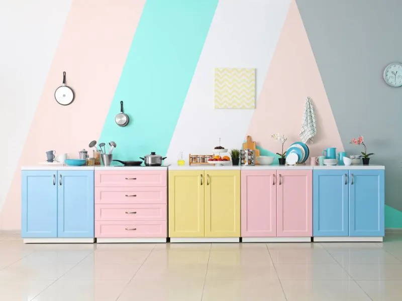
Cooler colors can be contrasted with warmer colors, or complementary colors like pink and green or yellow and purple can add vibrancy to a space.
Neutral shades are great for providing a balance between the two extremes.
With careful thought and consideration, any designer can use color combinations to achieve their desired atmosphere.
5. Psychological Effects of Colors
Colors can have a profound effect on our moods and emotions.
It is believed that specific colors evoke certain feelings, with cooler hues creating relaxation while warm hues generate energy.
- Reds often represent excitement and passion.
- Blues can be calming.
- Oranges suggest creativity and enthusiasm.
- Yellows can increase optimism and brighten up the atmosphere.
By carefully selecting colors for home design projects, designers can create an atmosphere to suit their client’s unique needs.
6. Color Context
Interpreting color correctly within the context of a design project is essential.
For example, green represents growth and progress in one context but rebirth and fertility in another.
The way colors are used in combination with other elements, such as type, and shapes, can have a great impact on the overall feel of a project.
Understanding the meaning of colors and their impact is an important skill for any designer.
7. Color Mixing
Color mixing is the art of combining two or more colors to achieve a desired effect.
The primary colors, red, blue, and yellow, can create an infinite variety of secondary and tertiary shades.
Color theory is an integral part of interior design that enables designers to combine hues to craft visually appealing compositions stylishly.
Mixing colors correctly allows designers to make the most of their palettes and create unique color combinations.
8. Square Color Scheme
The square color scheme is an effective design tool that uses four colors equally spaced on the traditional color wheel.
This color scheme creates a strong visual impact by combining complementary colors to create a dynamic and balanced composition.
Using the square scheme correctly allows designers to draw attention to some aspects while maintaining harmony between them.
The square scheme is often used in branding and advertising, as it provides balance and consistency when conveying messages through visuals.
10 Tips to Use Color Theory Basics for Interior Design
1. Use the Color Wheel
Use the color wheel to find complementary and analogous colors to make well-coordinated color schemes for your interior design project.
2. Understand Tints and Shades
Tints are made by adding white, making a hue lighter and more pastel. Shades are created by adding black, which darkens a hue and adds depth.
3. Pick Your Colors Carefully
Depending on the effect you want in a room, pick your colors according to whether you want to make it look bigger, cozier, or inviting.
4. Use Monochromatic Colors
To create a balanced yet consistent look, use one color with varying tints or shades of that same hue throughout the room decoration scheme.
5. Balance Primary And Secondary Colors
For a visually appealing composition of colors, select both primary and secondary color shades in an interior design project.
6. Think About The Proportion Of Color
Too much of any single shade can be overwhelming; pick different proportions of each color when creating an interior design palette for your home decorating ideas.
7. Consider Lighting Effects
Artificial lighting can alter the natural hues used in your home decorations, so keep this in mind when choosing colors for your project’s color palette.
8. Don't Forget Neutral Colors
Neutral tones like black, white, grey, brown, and beige can go with anything; add these shades into your interior décor as accents or as main focal points in any room design scheme depending on the desired effect you wish to create for that particular space within your house.
9. Pay Attention To Accents
Red, yellow, and blue are the primary colors and cannot be created by mixing other colors.
10. Experiment With Color Combinations
Red, yellow, and blue are the primary colors and cannot be created by mixing other colors.
Frequently Asked Questions
What are the 3 basic color theories?
Interiors can be designed using three basic colors theories:
- Monochromatic - Using one color and its various tones and shades
- Analogous – Using colors that are adjacent to each other on the color wheel
- Complementary – Using colors that are opposite each other on the color wheel
What are the 4 qualities of color theory?
The four qualities of this theory are hue, value, saturation, and temperature.
Hue is the color we see and is categorized by the primary colors red, yellow, and blue.
Value refers to how light or dark a color appears and is often used to create contrast within a composition.
Saturation determines how pure or intense a color appears, while temperature refers to warm and cool tones.
What are the rules of color theory?
The rules for color focus on combining colors in various ways that create appealing and aesthetically pleasing designs.
Some of the most common principles are the use of analogous colors, which are those that sit next to each other on a color wheel.
Another rule is using complementary colors, which are pairs of opposite hues on the wheel.
Another rule involves using split-complementary colors, which involve three separate hues from the wheel.
Lastly, the monochromatic color theory involves using multiple shades of one single color for contrast and visual interest.
What are the 7 color schemes?
The seven color schemes are:
- Monochrome - The Monochrome color scheme is when you use different shades of one single color.
- Analogous - The Analogous color scheme uses colors that sit adjacent on the color wheel.
- Complementary - The Complementary color scheme uses two opposite colors from the wheel.
- Split-Complementary - Split-Complementary is a combination of three hues – a base hue and two adjacent opposites.
- Triadic - Triadic is the use of three hues evenly spaced from each other on the wheel.
- Tetradic - Tetradic involves four separate hues – two sets of complementary pairings with an equal distance from each other on the wheel.
- Square - Square color schemes involve four separate hues in 90 degree angles from each other on the wheel.
What is the 60 30 10 decorating rule?
The 60 30 10 decorating rule is a guide to help create balanced and visually appealing interior spaces.
The rule suggests that when choosing colors for a room, 60% of the space should be one dominant color, 30% should be a secondary color, and 10% should be an accent color.
This helps bring focus to the design while also creating contrast and visual interest.
It can also help create a balance between the different elements within a room.
Conclusion
Color theory is an essential tool for any interior designer.
Understanding the basics of the color wheel and how to combine colors can help create stunning visual compositions that enhance any space.
This theory can also achieve specific psychological effects, such as calming a room or creating a sense of energy and enthusiasm.
With its wide range of applications, color theory is an invaluable resource for any interior designer looking to bring their projects to life.
📘 Related Reading: The Ultimate Glossary of Interior Design Terms
Lara Harding
Lara is a supporting author @ DIY Home Comfort. She's an experienced interior designer and decorator and a full-time mom. You can find out more about her here.
